
Organisations pick colours for t shirt printing projects through a handful of practical checks, not personal taste. There are a number of factors that contribute to the final shade, including brand palettes, event purposes, fabric behaviour, print contrast, and wearer comfort. Those who run these checks in sequence settle the colour question in a single sitting, whereas those who do not follow a process argue over shades for weeks and are still unsatisfied at the end. Five steps below trace the route most organisations take before any batch heads into production.
Colour selection steps – hand a project its structure, because an open-ended colour debate stalls entire orders. One question per step keeps a committee moving, brand rules open the sequence and wearer comfort closes it. Each answer trims the shortlist a little more, so by the last check, barely two shades remain, and the winner picks itself.
Matching the brand palette – opens the sequence since most organisations already have defined colours. Shades lifted straight from the logo or style guide keep every shirt in step with existing banners, uniforms, and printed materials. A tone sitting near the official palette still reads as the organisation from across a room. A random shade does the opposite, blurring recognition in group photos and public appearances.
Checking the event purpose – comes next, and the occasion changes everything. Sports days and outdoor carnivals ask for bright, energetic tones. Formal dinners lean toward muted colours. Cause-driven events often arrive with expected shades already attached, green for environmental drives, pink for health awareness walks. One organisation can happily wear different colours at different gatherings across a single year without losing its identity.
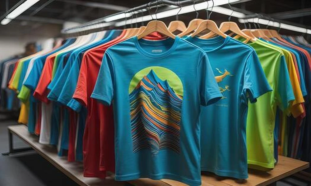
Testing fabric behaviour – deserves attention before any shade gets locked, because colour shifts between materials in ways screens never show. Cotton drinks ink and softens tones a touch. Dri-fit reflects light, so shades stay brighter under open sun. Holding a physical swatch under daylight, then again under office lighting, reveals the honest final colour, and that small habit spares teams the sinking feeling of opening boxes that look wrong.
Confirming print contrast – protects the artwork itself. Dark designs vanish on navy or black shirts unless a white base sits beneath the ink, and pale prints fade into light fabric almost completely. Sharp contrast between garment and design keeps a logo readable across a packed hall, something that matters most during stage moments and wide group shots.
Asking about wearer comfort – settles everything, because people wear only what feels right on them. A short staff poll surfaces quiet preferences fast, darker shades for everyday use, lighter tones for outdoor heat, neutral picks for members who shy away from loud colours. One afternoon of feedback lifts the count of shirts still worn months later.
Checks turn colour picking from a drawn-out argument into a clean routine. Brand palette sets the field, event purpose shapes the mood, fabric testing shows the true shade, contrast checking guards the artwork, and wearer feedback closes the file. Organisations following this order walk away with shirts that carry their identity, fit each occasion, and keep appearing in wardrobes for years afterwards.